Concept
This library serves as a place to collect and share code between projects and developers.
It includes libraries, Custom-elements and components for different frameworks to use in website creation and provides tooling to build and publish packages.
The components in this library are composed of two layers:
-
The first layer are Components. they ready to use, framework specific and pre-styled Components that give you a solid starting point. You do not import Components as dependencies, they are copied into your projects codebase like templates.
-
The second layer is the Elements layer. Elements are “Headless” custom-elements that only implement behavior with accessibility in mind, with as little styling as possible.
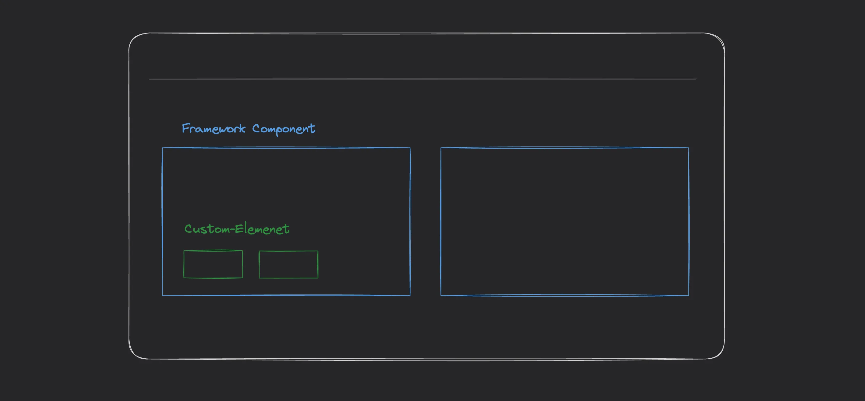
For example, this Accordion Vue Component, uses the <a-expandable/> custom-element to implement the animated expanding behaviour.
This approach gives the given project ownership over the components design. We start with sensible defaults, then change the design for the projects needs.