Usage
Requirements
Components require tailwindcss to be installed in the project. Here links for NuxtJS, Vite or Tailwind cli.
-
Install elements
-
Copy a component into your project.
This copies a component template into your project.
Terminal window npx @sv/components buttonDirectorysrc/components/
- Button.tsx
- README.md
- package.json
- …
-
Change styling or behavior of the component in the copy inside your project.
~/components/Button.tsx export const buttonVariants = {outline: "rounded-lg border border-[#C09278] px-6 py-2 bg-transparent",solid: "rounded-lg bg-[#C09278] px-6 py-2 active:bg-[rgba(158,118,96,1)]",ghost: "p-2 flex items-center gap-2 text-2xl hover:text-[#C09278]",};export default function Button(props: {variant?: keyof typeof variants;}, context) {return (<button type="button" class={`cursor-pointer ${buttonVariants[props.variant ?? "solid"]}`}>{context.slots.default?.()}</button>);} -
Import and use the components anywhere in your project.
src/App.tsx import "~/components/Button";<Button variant="outline">Click me</Button>; -
Or optionally use the custom-elements directly for most compatibility with, or without, a framework.
src/App.tsx import "@sv/elements/a-expandable";export function App() {return (<div><a-expandable opened></a-expandable>;</div>)}
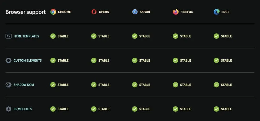
Browser Support
Can I use Support for WebComponents exists in major browsers since around 2018.